As part of the DOC’s website redesign, I was brought in to address challenges around underperforming calls to action (CTAs). I led the strategic effort to explore and define possible solutions, designing multiple variations to test different approaches. Using Maze, I conducted four comprehensive A/B and A/B/C tests with over 1,100 users, allowing us to gain true insight into user behaviour and identify the most effective CTA solutions. The outcome directly informed the site’s optimisation strategy and improved user engagement.
01. Overview
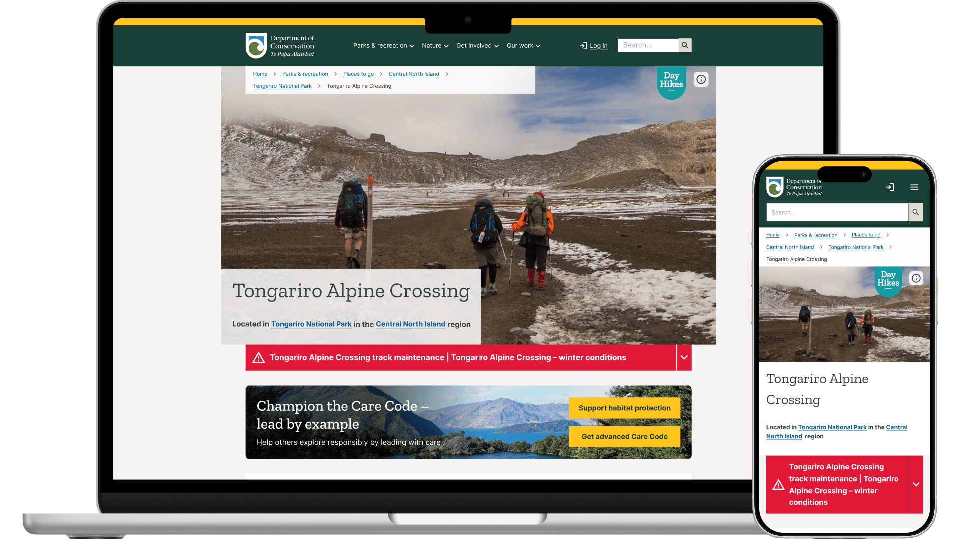
The Department of Conservation (DOC) was preparing to launch its Always Be Nature national campaign, aimed at inspiring New Zealanders and visitors to actively support conservation efforts. With a significant marketing investment on the horizon, I needed to ensure that website visitors, whether arriving to plan a trip, learn about conservation, or support environmental initiatives, would be guided towards meaningful action instead of leaving without engaging.
To achieve this, I designed and validated a Call-to-Action (CTA) strategy optimised for multiple user types and devices. The project involved extensive testing, behavioural analysis, and the creation of an implementation-ready design system that could be deployed in time for the campaign launch.
02. Problem
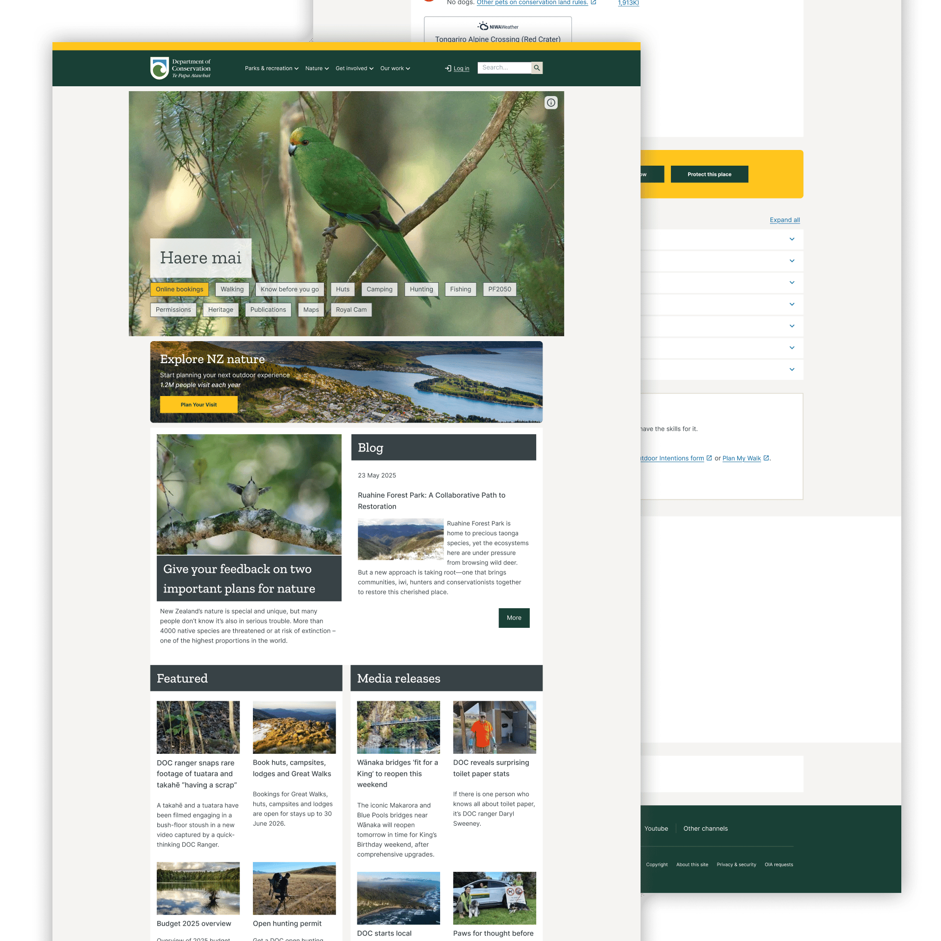
DOC’s website attracted a wide variety of users, from Casual Explorers planning hikes to Conservation Champions eager to donate and volunteer. However, the existing CTAs were generic, inconsistently placed, and not tailored to the diverse motivations and behaviours of each audience segment.
Key issues included:
• One-size-fits-all CTAs that did not acknowledge different user motivations.
• Ineffective placement with CTAs often appearing too late or in the wrong context.
• Low visual engagement with modules lacking authentic imagery and impact data to inspire action.
• Device-blind design that showed desktop and mobile users the same formats despite very different interaction patterns.
Discovery Process
Early Insights
03. Design Process
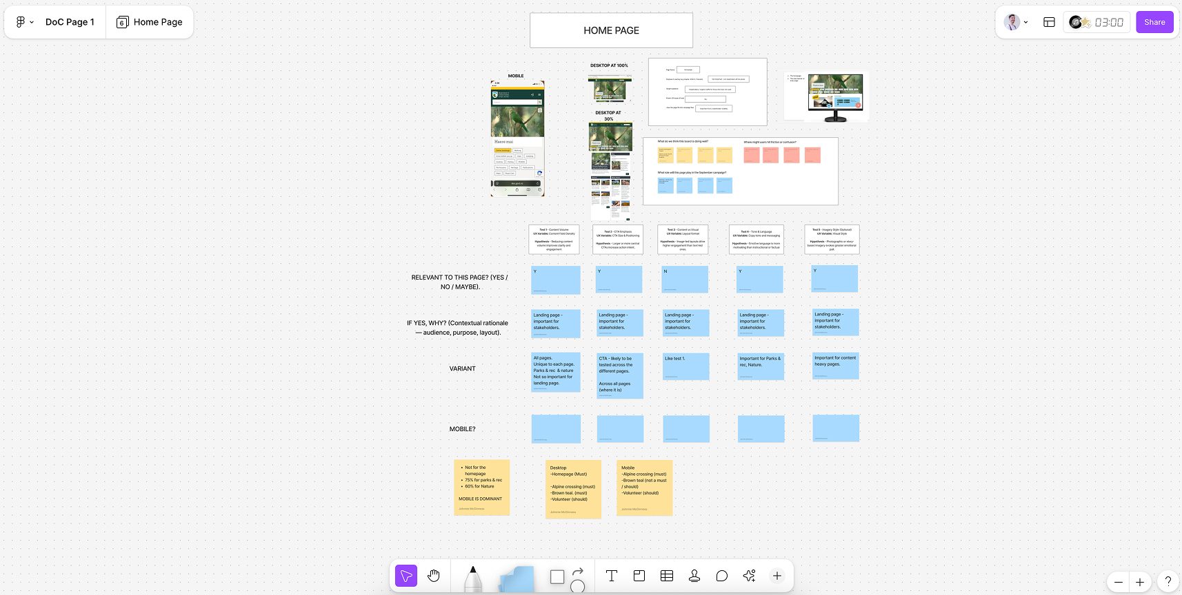
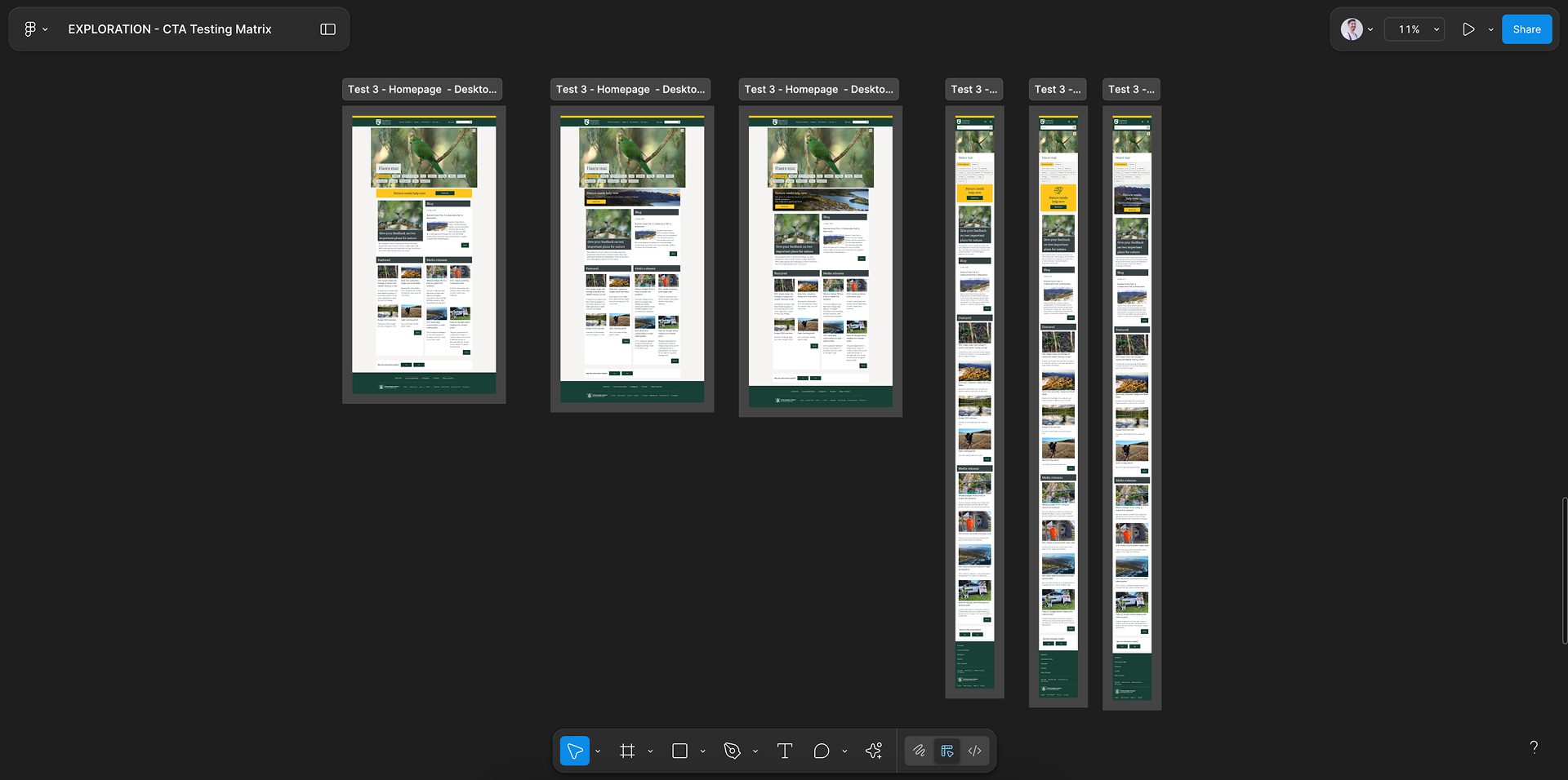
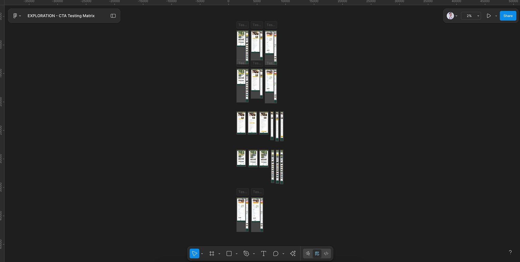
1. Discovery and Testing
We conducted 4 comprehensive A/B and A/B/C tests with over 1,100 users across desktop and mobile. Using behavioural tracking, heatmaps, and preference surveys, we evaluated:
• CTA structure (single, stacked, split options)
• Placement (top, middle, bottom, sticky)
• Visual complexity (light, medium, high)
• Messaging tone (directive vs collaborative)
These tests revealed four clear audience segments: Hands-On Conservationists, Conservation Champions, Casual Explorers, and Curious Learners, each with distinct motivations, frustrations, and engagement triggers.
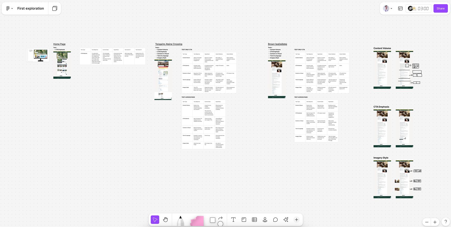
2. Strategic Framework
We combined user insights, test results, and UX principles to create a device-context strategy, complexity calibration, and content-first integration approach:
• Device-Context Strategy: Sticky CTAs for mobile, stacked CTAs for desktop.
• Complexity Calibration: Rich, authentic imagery for high-engagement users, simple utility-focused CTAs for trip planners.
• Content-First Integration: Embedding conservation opportunities within existing trip planning and recreation content.
3. Solution Design
I designed three ready-to-deploy CTA modules:
• Type A – Simple Sticky CTA: Minimal text, persistent on mobile, trip-relevant messaging.
• Type B – Dual Split CTA: Moderate complexity, two complementary actions, ideal for high-scroll pages.
• Type C – Complex Stacked CTA: Rich imagery, conservation statistics, and multiple engagement paths for highly invested users.
Final Concepts
04. Solution & Results
The new CTA system provided an evidence-based, user-validated toolkit that matched the right format, placement, and content to the right audience and device:
• Higher user satisfaction from offering multiple engagement options, with stacked CTAs winning 55–64% preference.
• Mobile conversion boost from sticky CTAs, achieving a 4.7% click-through rate compared to 1.3% for static placement.
• Dramatic engagement gains from high complexity, authentic imagery modules, reaching up to 84% preference and 13.2% click-through rate on mobile.
This approach ensured that every visitor, from casual trip planners to passionate conservationists, had a clear and relevant pathway to participate. The system was ready for immediate integration into the Always Be Nature campaign, with a six-month optimisation plan to maximise impact over time.